Case study
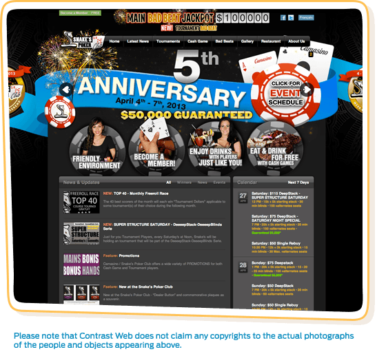
Throughout the summer of 2011 we were brought in by a local brick and mortar business named Snake’s Poker Club to build new solutions for their business. Based in the Kahnawake Mohawk Territory (a Canadian Indian reserve), the business holds one of two licenses issued by the Kahnawake Gaming Commission, allowing them to operate Poker Rooms.
With fierce new competition right around the corner, Snake’s Poker needed improved methods to retain their client base & acquire new business. They hired us to redevelop their online identity which would serve as their new tournament scheduling / promotion platform, & months later once again to develop an internal reward system, making use of magnetic membership cards, touch screens & web technologies. In this case study, we’ll cover the development of the website.

Digital Strategy
Before we could lay down strategies, we needed to understand the business. Over several days, we sat down with directors, managers & miscellaneous staff members to get a clear picture on the operations. The business was primarily supported by two services: Cash Games & Tournaments.
Given that Cash Games held a higher profit margin, it was also the most difficult service to fill. As an example, it could be compared to the bar scene. The more buzz around the spot, the bigger the likelihood you’d see people collaboratively spending money on drinks. The same analogy applied to the Poker Room business, as the more individuals hung around the club, the more chances you’d see them spending on a few Cash Games.
Tournaments involved less risk to players, & provided chances to come out on top with large sums of money for winning seats. The problem with the service were the margins, they were low. On the upside however, they served as great events to fill up the venue & create that sense of busyness.
Our analysis concluded that the business needed a new tool that served many functionalities spanning from marketing to management. With those details concluded, we were able to make some new assumptions for our next development moves:
-
- Develop a unique style that would set the brand apart from its few local competitors.
- Develop an news publishing platform that would serve as a microphone for business-to-visitor communications with additional requirements to support both English & French languages.
- Develop an event publishing platform that would schedule tournaments, set related results, photo galleries, news & most importantly build a historical map of the business’ activities with additional requirements to support both English & French languages.
- Develop a friendly user interface for easy management.
- Develop an easy way for website visitors to sign up on the website & become new club members.
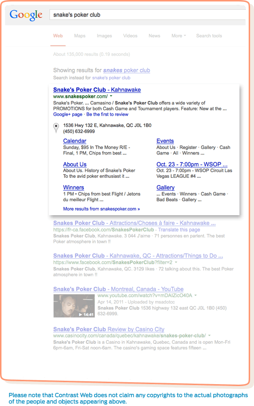
- Develop an SEO strategy to set the markup in the right direction for proper indexing activities.

Direction
Considering the business circled around tournaments, which were affordable enough for most individuals to trial at least once, we decided to centre the core of the web product around the service in hopes to achieve the following:
-
- Showcase the business’s activity & continuous pivoting activities to match the demands of the clients.
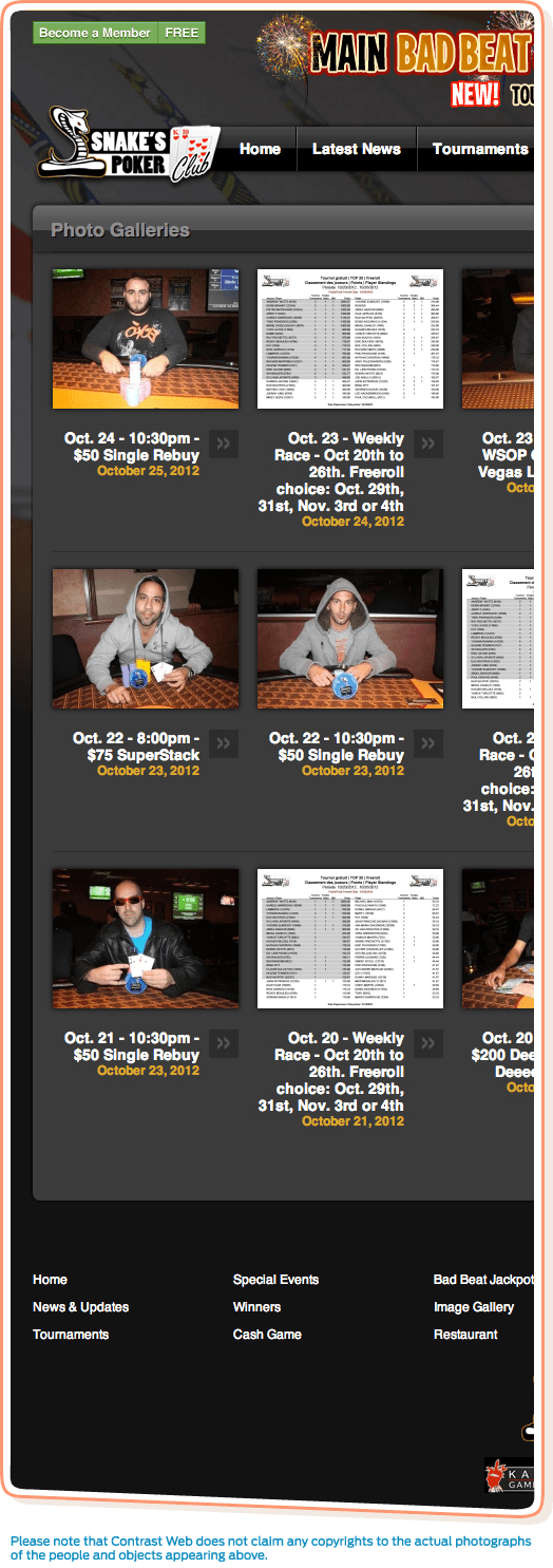
- Showcase the events through photo galleries.
- Showcase the winners & their earnings to validate the value of the events.
- Showcase the news related to events.
- Spark interest in the club for new members.
- Provide a go-to place for customers to verify tournament schedules.
- Gather data about past events in order to anticipate future business moves.
Once we broke down the details, it was time to apply our web notions to shape the product’s architecture & design an immersive experience.
The point of an engaging website is to make it indulging enough, that your visitor spends countless minutes browsing through pictures, news & other pages without even noticing the time fly. Mix these notions with clever marketing triggers at key moments, and you’ve got yourself a new lead generator for your business.
So how did we apply these relation tactics to this business? It’s simple, we put tournaments at the top of the chain, & started breaking down the related disciplines. What fit into each tournament? Tournament results, pictures & news articles. Great, now wouldn’t it be great to see those related assets on the same page while you’re reading an article, or even viewing related screenshots? What if all these related items were just one click away from each other, wouldn’t that make the browsing experience more pleasant?
The system acted like a living entity in which there was no right direction to follow, it was designed for the visitor to go with the flow. Such website designs are usually seen across popular news media websites of any niche as they’re designed to create engagement into the product. Our knowledge of such design stems from Contrast Web co-founder’s experience in the video gaming online publishing space as seen in the PS3 Center Case Study.
Our ideas didn’t stop with a finely designed relation system. We wanted the business to have the ability to set itself apart from competitors for each tournament. We decided to build a website background reskin system, which allowed for the theming of each tournament page.
Not only did this give the opportunity for the business to stand out for each event, but also gave a creative edge over the competitors. The feature played nicely in the space of generating additional revenue for the business as the steady traffic & well defined target audience would become a great fit for advertisers to place ads. The background reskin feature would also serve as an ad space for brands to promote on. It provided enough real estate space that a brand could set clear graphics, texts & call to actions.

Analytics
After we developed the web product & the customer began using its full functionalities, statistics showed the results instantly. If we compare the following periods:
-
- New Microsite: September 3th, 2011 – March 11nd, 2011
- Old Website: February 25th, 2011 – September 2nd, 2011
We receive the following results:
-
- Page views increased from 49,844 to 147,437. An increase of 195%, proving that the visitors were deeply interested in the content provided by the website.
- Average visitor duration increased from 51 seconds to 2 minutes 31 seconds. An increase of 197%, proving that the content relation was engaging users to browse the website for longer periods of time.
- Visits from the United States increased by 20%, proving that new American customers were interested in their services due to the website’s visibility through search engine results. A variety of international visitors also increased.
- Over 58% of the visitors viewed the website daily. This proved that the website was indeed a replacement tool for phone calls to the business – reducing stress on staff.


